Journey iOS November '24 Update: New Interface Design
The November '24 Journey iOS update features a sleek navigation bar, an enhanced Stories interface with a mesmerizing parallax carousel, and the ability to effortlessly sort entries by date. Upgrade now and immerse yourself in the stunning new interface experience!

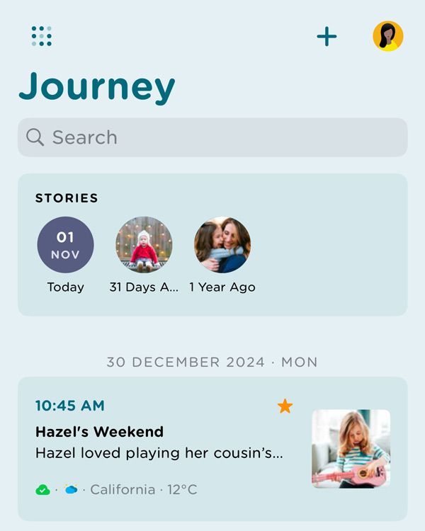
As the leaves turn and November ushers in a season of change, Journey iOS users are in for a treat with the latest app update. The November '24 edition brings a delightful transformation to the Journey iOS app interface, ensuring an even more seamless and enjoyable journaling experience.
Here's a look at what's new and improved.
A Sleek New Design for the Bottom Navigation Bar
Journey's November '24 update introduces a refined and stylish design for its bottom navigation bar. User interface elegance has been taken up a notch with a sleeker look that not only beautifies the experience but also enhances usability. This redesign reflects a commitment to combining form and function, making navigation more intuitive for users.


One of the standout features is the repositioning of the "Add New Entry" button, now conveniently located beside the bottom navigation bar. This change makes adding new entries easier than ever, allowing users to instantly capture their thoughts and experiences with a simple tap.
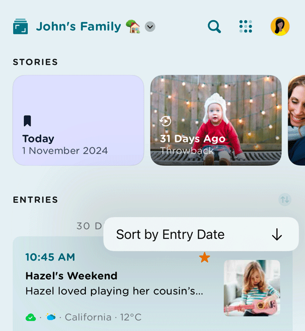
Sort Entries by Date

For users who love to keep their entries organized, the update brings a much-requested feature—sort entries by date. Whether you're reminiscing or searching for a particular moment, this new sorting option helps you navigate your memories with ease, making it a breeze to find exactly what you're looking for.
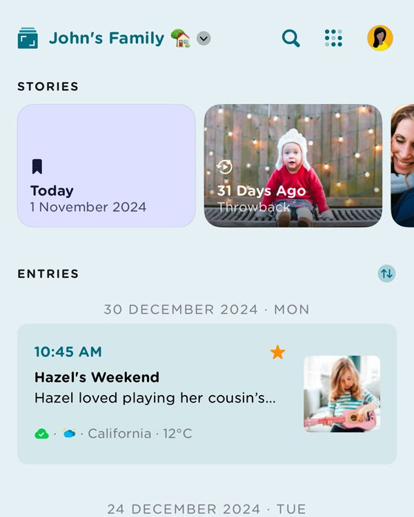
A Breathtaking New Stories Interface

Get ready to be captivated by Journey's redesigned Stories user interface. The upgraded design features a visually stunning carousel with a parallax effect, adding depth and dynamism to your personal journal. As you browse through your stories, watch them come to life in a way that is immersive and engaging!
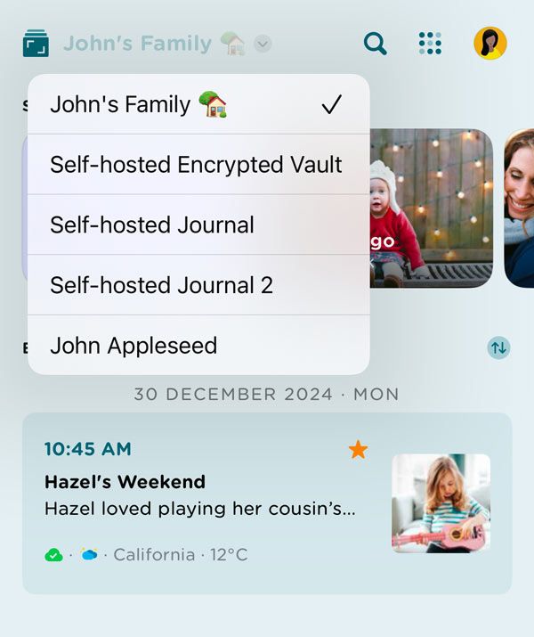
Quick and Easy Switching Between Cloud Storages

In response to user feedback, Journey has streamlined access to multiple cloud storages with a new quick-switch feature. A dropdown menu located in the top left corner of the app lets you effortlessly toggle between your preferred cloud storage. Whether you're a using Journey Cloud Sync, Google Drive , or self-hosted drive, managing your journal data has never been easier.
Improved Search & Odyssey AI Experience


With the Journey November '24 update, finding what you need has become even easier. The search function is now permanently located at the top-right corner of the app and is no longer hidden when scrolling through the entries. Next to it, you'll find the Odyssey AI feature. This new placement ensures that Journey's robust search capabilities and Odyssey AI are always at your fingertips, providing instant access to intelligent insights as you search and explore questions about your life.
Journey's iOS November 2024 update underscores a dedication to enhancing user experience with thoughtful design improvements and new features. Whether you're a seasoned journaler or a newcomer, these changes promise to make your journaling process more intuitive, enjoyable, and beautiful.
Stay tuned for future updates as Journey continues to evolve, and don't hesitate to share your thoughts with the development team. Your feedback is invaluable as they work to create the best digital journaling platform for everyone.


