Journey Android Updates - Design & Interface Revamp
This February, we are thrilled to announce that Journey on Android will now adopt a revamped design interface! With accessibility, efficiency, and ease of use at the forefront of our priorities, read on to find out more about how we have revamped according to Material Design 3's design philosophies!

In light of working towards making your journaling and reflection processes as seamless, efficient, and as enjoyable as possible, we are excited to unveil the latest version of Journey to our Android users.
Version 5 of Journey on Android will adopt a refreshed color palette, and comes with a rewritten Jetpack Compose, and comes with tweaks that we have made to the app interface. Designed along M3's, or Material Design 3's design guidelines, Journey on Android now offers an elevated journaling experience with a revamped interface, features, and brand-new color schemes.
Read on to find out more about what you can expect in Version 5 of Journey on Android!
What is Material Design 3 & Its Philosophy?
Material Design 3 is Google’s latest approach to app design. It is a system of guidelines and tools that support the best practices of UI design. M3’s philosophies include accessibility, adaptive design, and customizing material.
1. Accessibility
Accessible design enables users of different ability types to use, navigate, understand, and enjoy an interface. This allows apps to enhance their usability for all users and people.
One of the few ways that accessibility is ensured is through color and contrast. Color and contrast can be used to help users see and interpret your app’s content, interact with the right elements, and understand actions better. Sufficient contrast ratios are important for users to distinguish various text and non-text elements. Higher contrast makes the imagery easier to see, while lower contrast images may be difficult for some users to differentiate in different light conditions.
2. Adaptive Design
Creating adaptive and functional design refers to considering how product layouts can adapt to fit different screen sizes and form factors including mobile, tablet, foldable, and large-screen devices. With adaptive design, different fixed layouts are created that adapt to the users' screen size. As opposed to the more fluid responsive approach, adaptive design employs multiple sizes of a fixed design.
3. Customizing Material
By customizing material, M3's color system embraces how color can reflect an app’s design sensibility, while also making space for individuals to choose settings for themselves. With M3, apps can express their brand identity through with use of colors in the dynamic color scheme. Apps can easily generate key colors and their complementary generated tones to use throughout their interface.
Brands or individuals being able to input a custom key color that automatically gets assigned a set of complementary tones in an interface makes space for expression and creativity.
Journey's Philosophy on Material Design 3
Version 5 of Journey on Android has a revamped interface that reflects the above and the latest changes in Material Design's philosophy of design.
With accessibility, the importance of adaptive design, and customizing material in mind, this version provides more tools that will enable Journey’s users with diverse abilities to maneuver, understand, and enjoy the interface as best as possible, allow users to customize their diary to their liking with features such as choosing color themes, and allow them to use the app from different personal devices and screen sizes more efficiently.
1. Accessibility
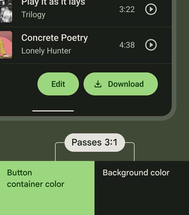
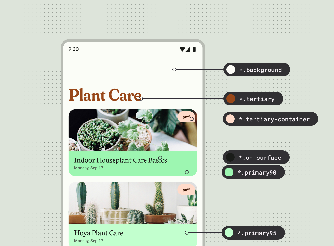
On Journey Android, the color and contrast makes the interface more accessible. You can now pick a color scheme from the curated list of color schemes by M3 for your personal interface. The system will generate a color scheme that makes the interface readable and accessible to anyone and everyone.
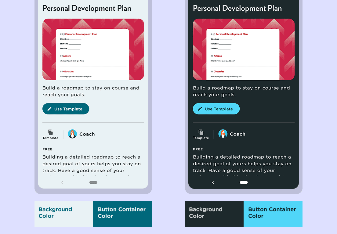
With the hierarchies of elements being stratified with colors instead, the buttons, text, and interface background and elements are a lot more prominent. The contract rations adhere to M3’s guidelines of 7.7 and 2:1. The button text color and the button container color, and the background colors follow M3’s ratios of 4.5:1 and 3:1 respectively.
2. Adaptive Design
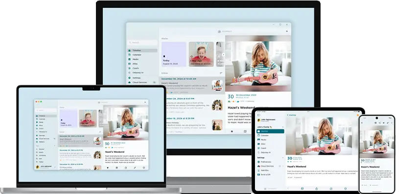
Journey on Android will now be a much more interactive and responsive interface. With larger or smaller screens, the layout will automatically resize to better fit the screen size of your device. As the layout changes for different screen sizes, the interface will also respond accordingly.
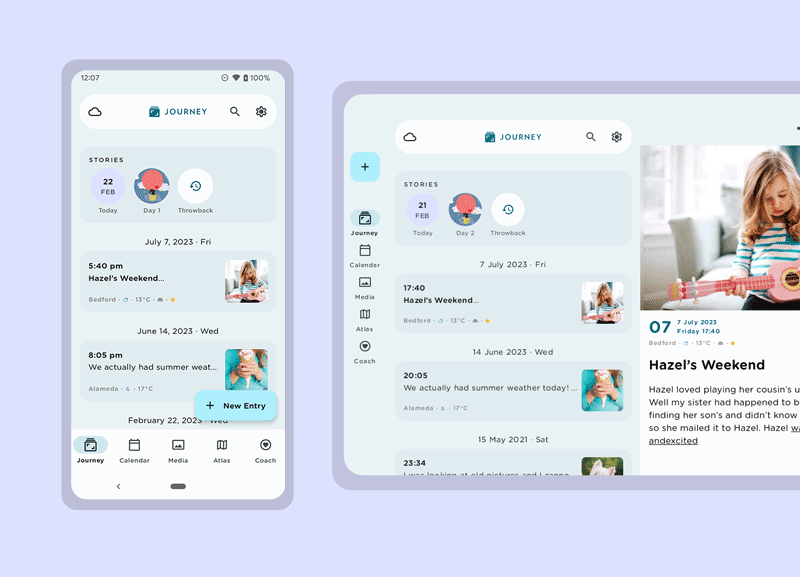
The app now takes advantage of larger screen sized devices such as tablets and Chromebooks, with the introduction of Journey’s two-pane split view layout which can now accommodate larger devices like tablets, Chromebooks, and even foldable devices.
In the first pane, the screen displays the default content selected from the tab i.e. Journey, Atlas, Calendar, Media view. When users select an entry to preview, selected entries will be now displayed in the second pane. We have also the introduced navigation for when the app window is expanded to a larger size. The bottom tab will transform into a navigation rail in larger sized windows.
3. Customizing Material
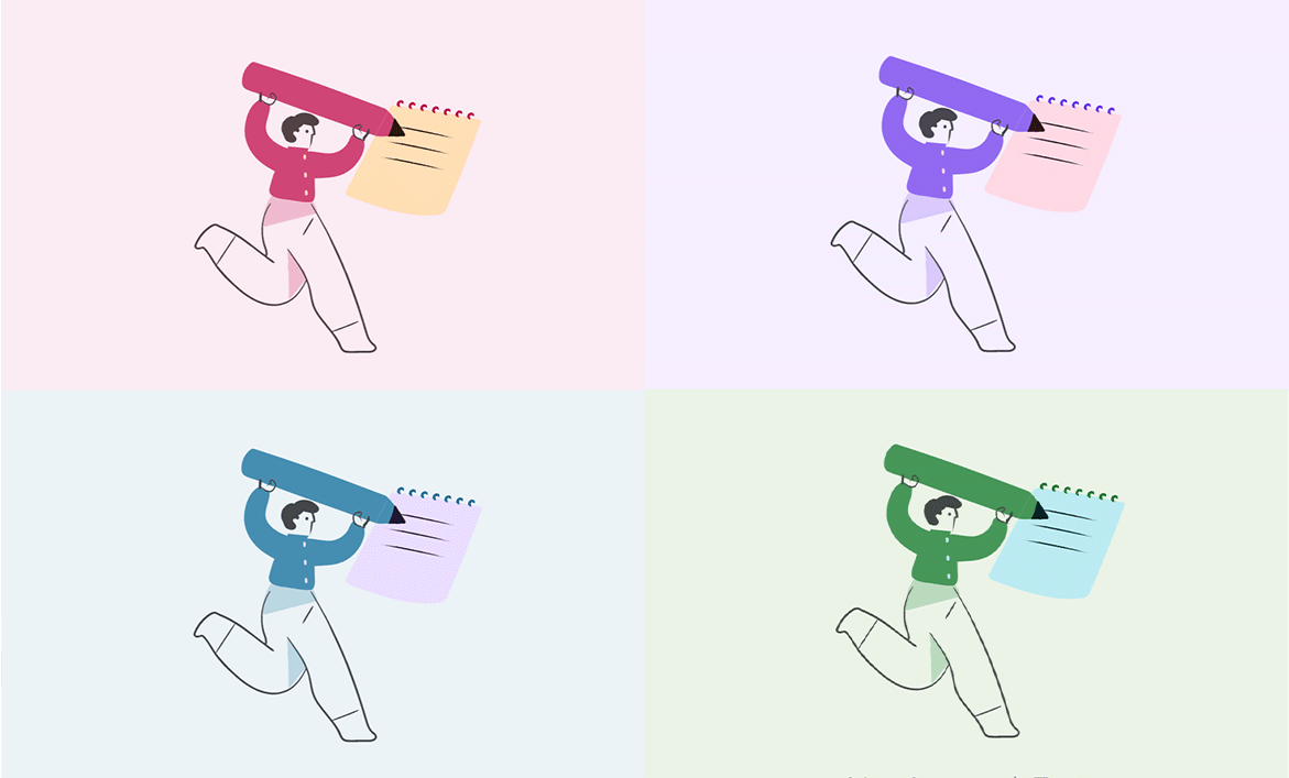
Journey allows users to customize the looks of their personal diary. This can be done by changing the theme color of the app's interface. The theme in Journey has also been designed with the core principle of accessibility and the color and contrast guidelines in mind. Journey makes use of the M3’s color schemes, that we have incorporated into the 13 available color themes for users to choose from. The color of the app’s background, the container, buttons, and texts change according to the M3's color schemes.
For the empty states in Journey, the imageries follow M3’s color scheme closely. This is tricky, especially when there are 13 color themes to consider; including their light and dark modes. But the tones and hues for each have been curated according to the dynamic color guidelines provided by M3, and the results have been coherent with the available color themes and pleasing to the eyes.
Other Notable Changes
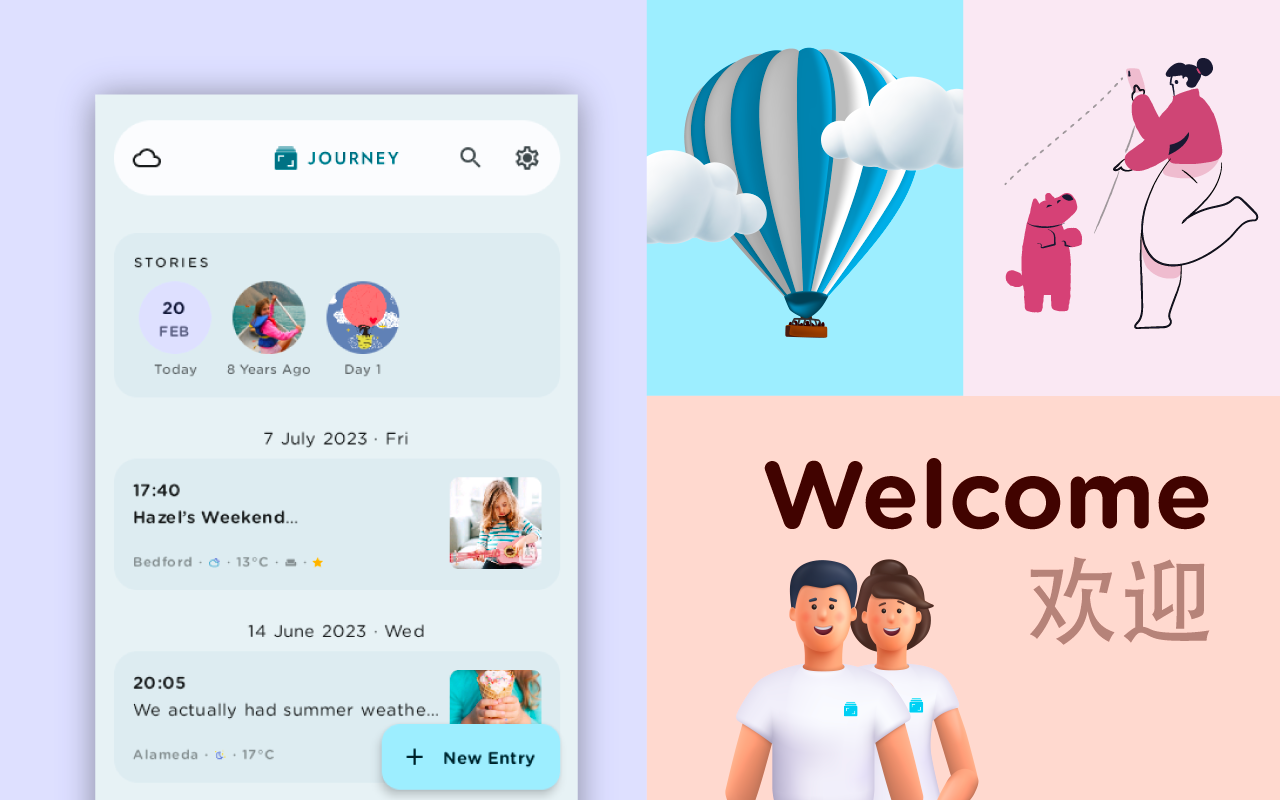
1. Introducing Neumorphic 3D Images
In the past versions, Journey embraced flat, 2D design to covey messages through imageries. In Version 5, Journey has adopted a fresh perspective with the introduction of neumorphic designs. These imageries can be found on the onboarding pages, alert dialogs, add-ons, and more.
This visual style that combines background colors and shapes, is different from Journey’s previous flatter and more minimal imagery. Now, the imageries that are interspersed in the app, from imagery you see in the onboarding pages, to the empty states, and various tools like the calendar, atlas, and Journey Coach mimics real-life objects a little more to bring realism to the interface and your experience.
2. Font Changes - Typeface & Size
Typography plays a vital role in the way users interact with an app. If content is cluttered with varying point sizes, it will be difficult to read.
Previously, the font size on Journey was fixed. On larger devices, fonts appeared smaller, and users could not change the font size as well. The font size on Journey’s latest iteration will be changed throughout the app interface to follow the system font size that you set. You can now choose a font size that you are comfortable with.
The font type has also been changed to a more rounded typeface. This enhances the readability of text in the app, and provides a more comfortable reading experience for users who wish to relive their memories.
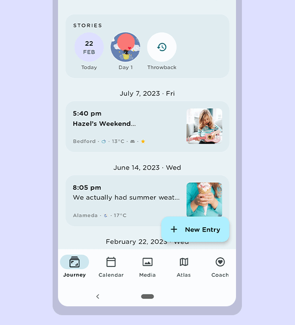
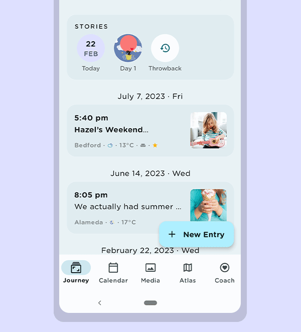
3. Introducing Timeline in Calendar
In Version 5 of Journey, we have introduced the timeline in the Calendar tool. When you click on a specific date, the entries of that chosen date will be shown. To access another date, users can scroll the timeline and pick another date instead of heading back to the calendar to do so.
Compared to the previous versions of the Calendar on Journey, the latest iteration reflects more colors as well. The expanded colors allow users to better identify secondary action buttons and different functions in the calendar.
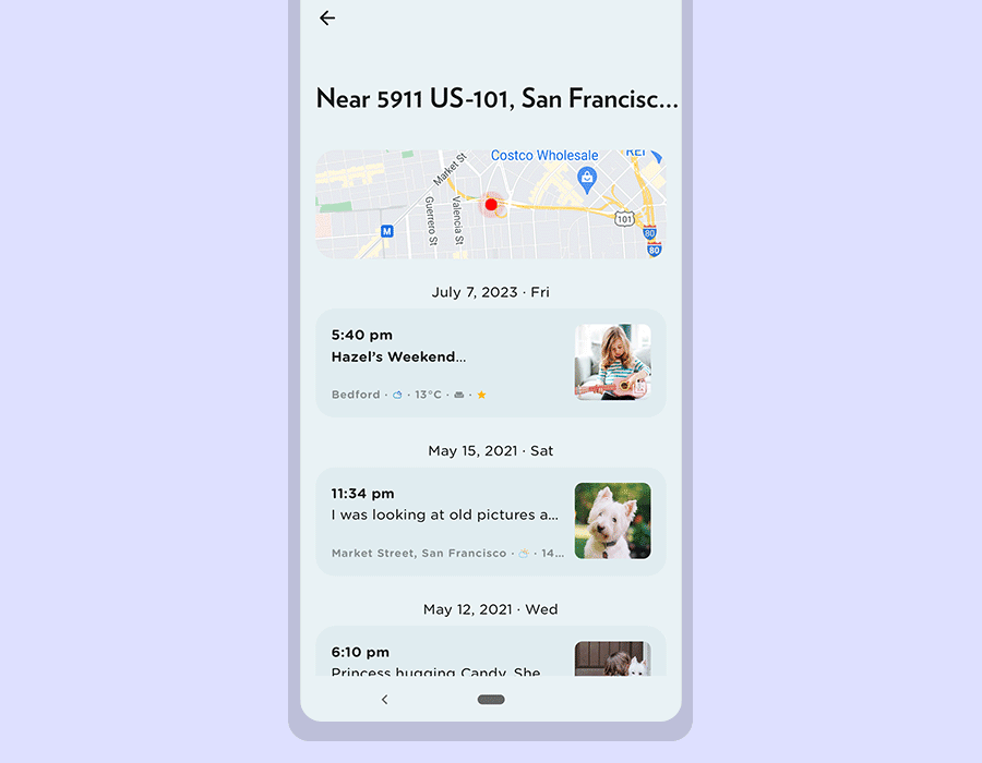
4. Introducing Map in Timeline
For this iteration of Journey on Android, we have revamped the Map tool to display more information.
When users click on a cluster on the map, a list of entries from that particular location will be shown, and you can view multiple entries from a photo cluster. Together with that, a map of where the cluster of photos were taken will be displayed at the top as well for you to view the location clearly.
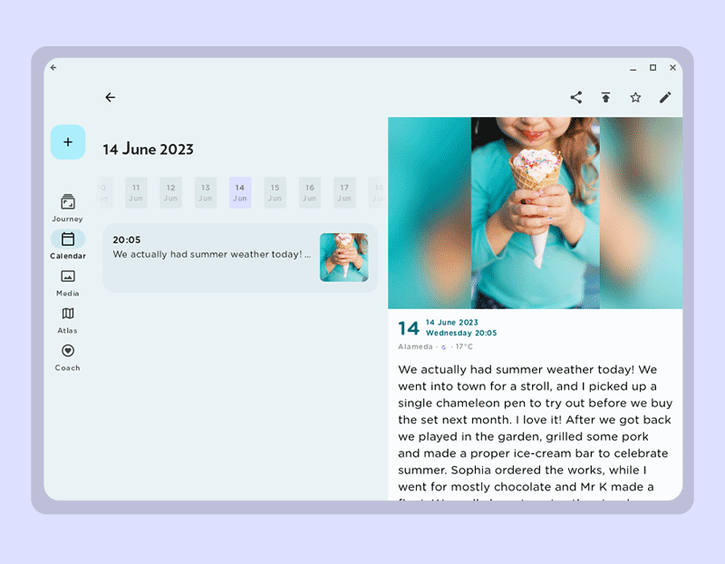
5. Revamped Editor
In version 5, Journey’s editor has been improved and updated along the M3's design guidelines and changes have been made to some key items in the toolbar.
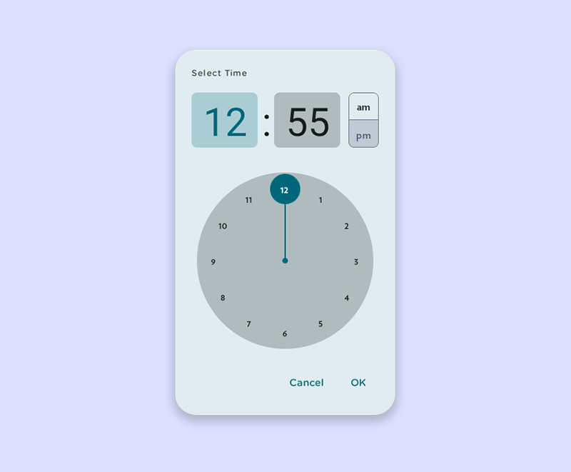
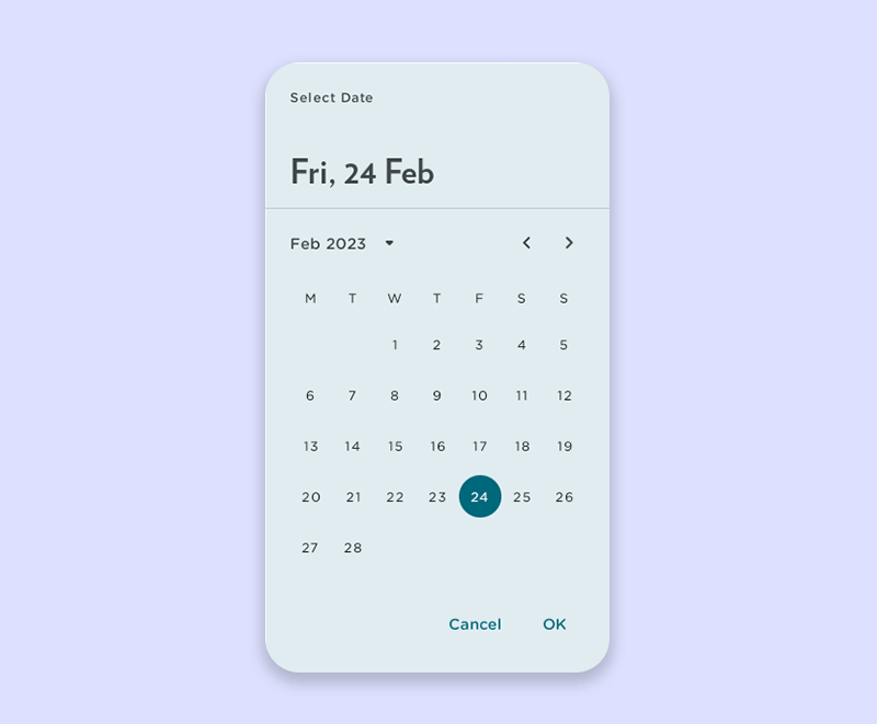
The editor has been updated with M3’s color scheme in place, and with key components of the editor such as the date & time picker, tags, activity and sentiment dialogs having been re-designed using M3 components, or interactive building blocks, such as action, containment, navigation, selection and text-input.
Key items in the bottom toolbar have been reorganized. The headers, blockquote, and lists are now consolidated in a paragraph style menu, and the link, table, pre code, and horizontal rule have been merged into a single insert menu for you to access.
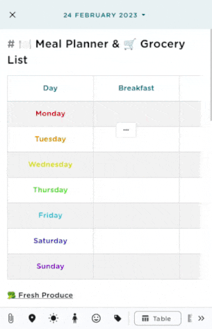
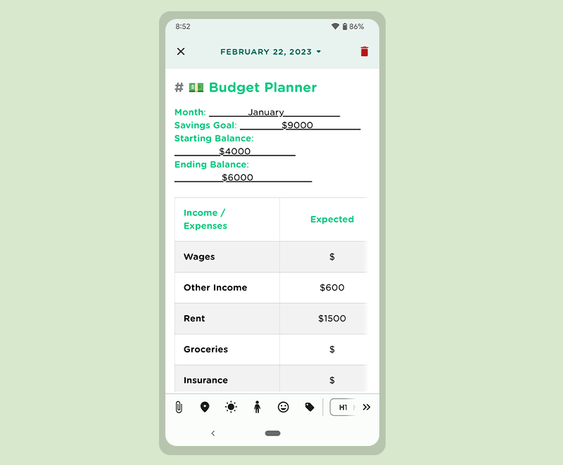
Previously, the width of the table fit the viewing screen of mobile devices, resulting in the columns and its contents to get smaller as more columns were added. The table has now been optimized for mobile devices, and the size of the columns has been fixed. You can also scroll through the table to view more columns on your screen, if you were to add more. As a newly introduced feature, you can now also change the text alignment in individual columns; be it left, centre, or right aligned text.
6. Revamped Coach Programs & Journaling Templates
With the next iteration of Journey on Android, Journey Coach would offer both Coach Programs as well as journalling templates that can guide your journaling and reflection all in one place. Here, you can navigate featured coach programs and explore featured coach programs a lot more seamlessly on the combined platform.
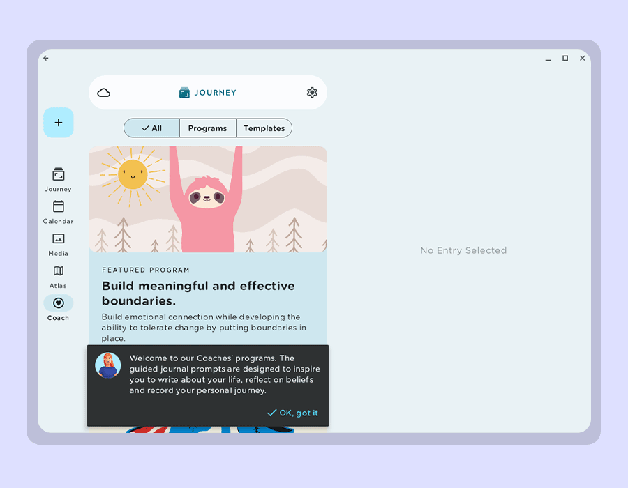
On Journey Coach, explore guided journaling programs from multiple life coaches that you could choose from to reflect with. You can also read about the coaches we have on board in the "Featured Coach" section. The changes in the layout of Journey Coach, with new banner styles and program information are now friendlier and easier to navigate.
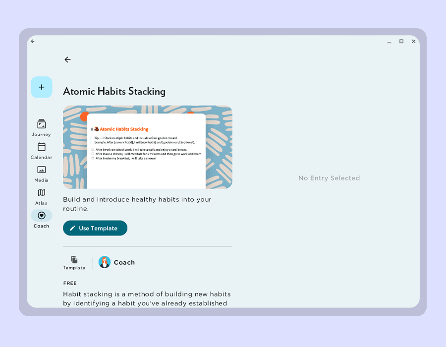
Having been previously made available on Web and iOS only, templates are now available on Journey’s Android app with V5. From templates for self-improvement, to relationship essentials, healthy living, pregnancy journey, and many more, the templates can be used as bedrocks for your journaling and daily routine. To make this as convenient as possible, when users pick a template, it will also automatically be migrated into the editor for you to write with.
Material Design 3’s core principles of accessibility, adaptive design, and customizing material have guided the new changes you can experience in V5 of Journey on Android. Journey has adapted these philosophies to enhance the user experience by making the interface more embracing and welcoming, more customizable, and more compatible with multiple devices and screen sizes.
With the fresh color schemes, interactive designs, responsive layout, better font display, and amendments to some of our tools such as the calendar, map, and Journey Coach, we hope that Journey better serves you as an all-encompassing journaling and self-care companion.
We will be adopting these design philosophies and applying them to V5 of Journey on iOS and the Web app. The updates available for Android will be made available to users who wish to explore them by joining the Beta group via Google Play Store.