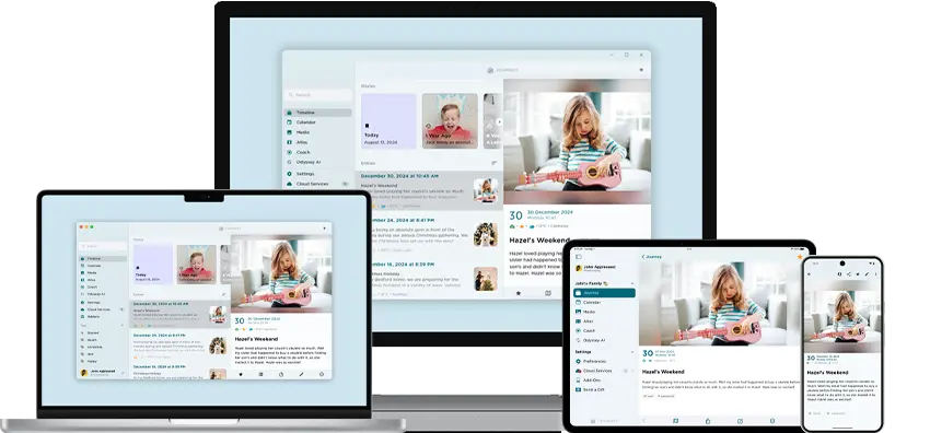
Journey Web Updates - Updated Designs And Interface Revamp
This June, we are back with a revamped and re-designed Journey Web! With the re-designed web interface, new features, refined tools, and an updated editor, your user-experience is being continuously improved. Read on to find out more about what you can expect on Journey's new Web interface!
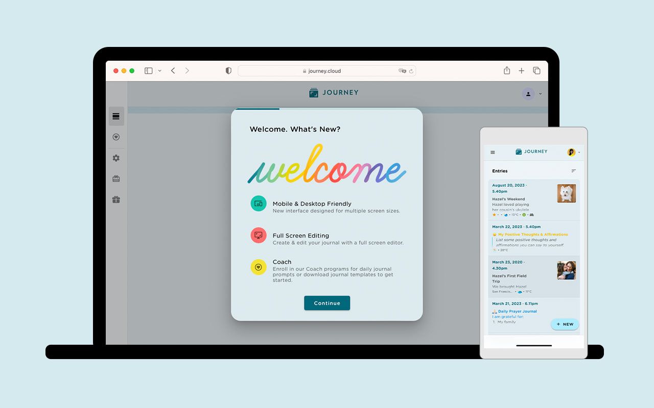
This June, we are back with some exciting news for Journey users. Journey web now comes with a revamped design, improved editor, and brand new template functionalities for you to explore.
Journey's latest web updates now offer users an elevated journaling experience with improved colors, a streamlined layout, and additions to the web editor. Read on to find out more about these features and what you can expect from Journey web.
New Interface Design
1. Updated Colors Scheme And Visuals
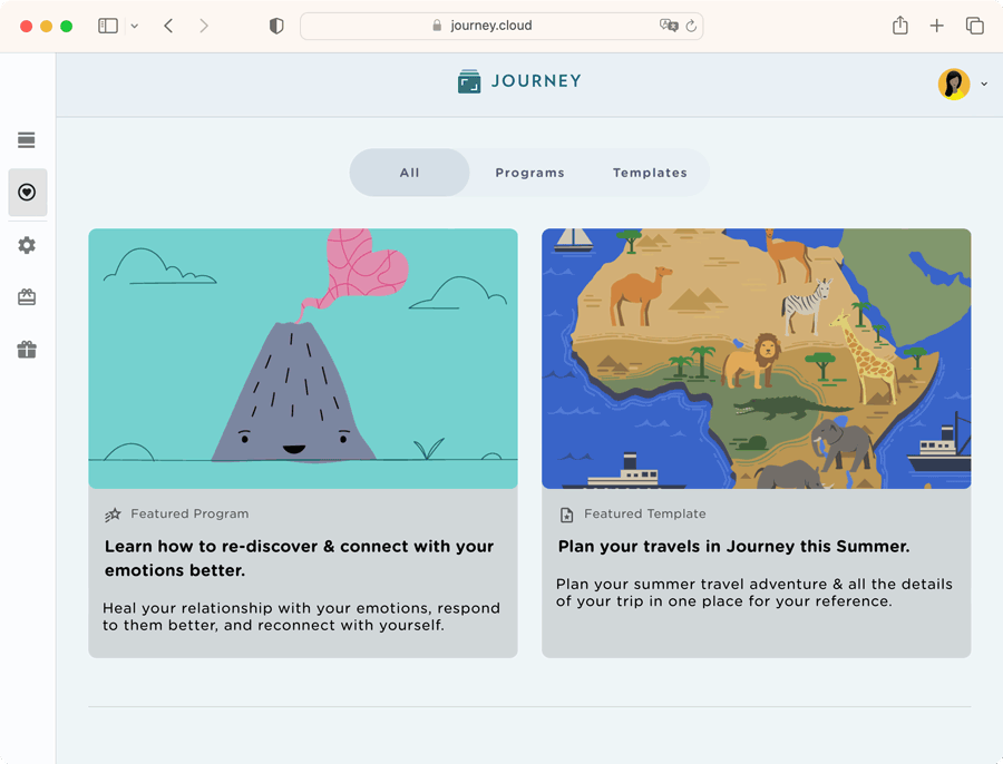
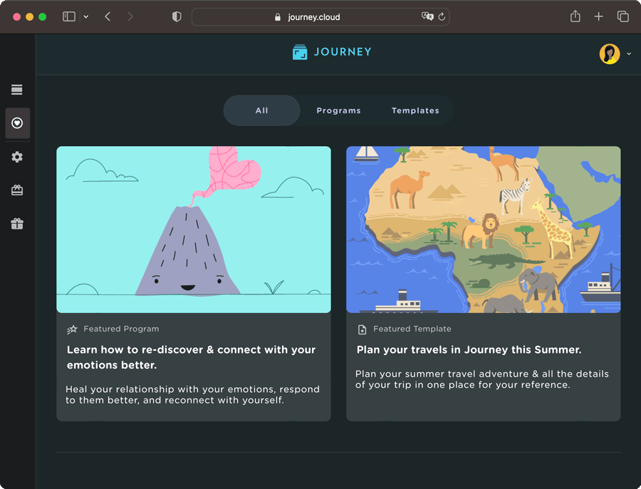
From a visual standpoint, Journey web's colors and visuals are now more aligned with M3, or Material Design 3's, design principles. In the previous Android updates announcement, we outlined M3's design principles to be accessibility, adaptive design, and customizing material, and how Journey's adaptation of M3 would enable users with diverse abilities to maneuver, understand, and enjoy the interface as best as possible.
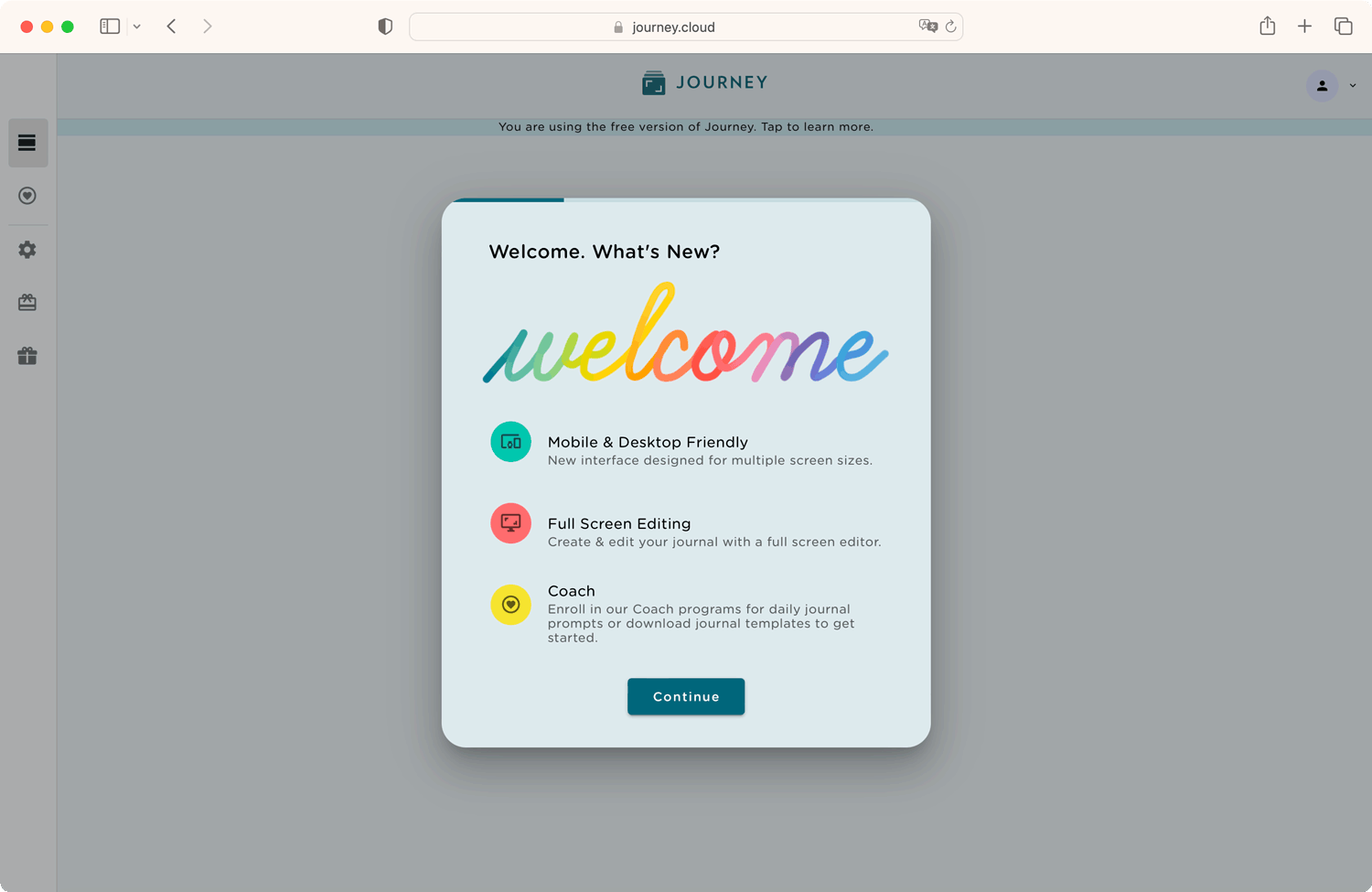
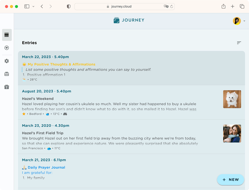
Now, with the M3 colors and visuals on Journey web, it would be more familiar to Android and iOS users. With the hierarchies of elements being stratified with colors better, the color of the app’s background, the container, buttons, and texts change according to the M3's color schemes and are a lot more prominent.

The timeline, editor, Journey Coach; Programs and Templates pages, have also all been re-designed with M3 design principles in mind. This is reflected in visual elements such as the rounded buttons, text formatting, and new icons. These visual elements create a more friendly and welcoming space that users can feel safe journaling in and feel encouraged to journal more in, and the new color schemes make it easier for users to read and navigate through the interface.
2. Customize Your Diary With Color Themes
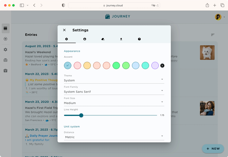
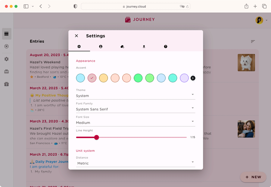
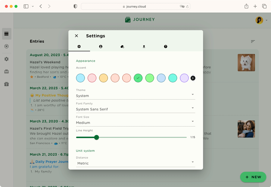
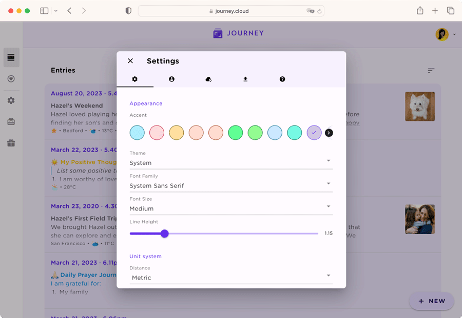
Journey web now allows users to customize how their web diary looks like. This can be done by choosing the theme color of the app's interface. Journey makes use of the M3’s color schemes that we have incorporated into 13 available color themes for users to choose from for Journey web. The color of the app’s background, the container, buttons, and texts change according to the theme they choose and along M3's color schemes.
3. Dark and Light Themes That Change According to M3
On Journey web, the color and contrast of both Light and Dark theme makes the interface more accessible. For either Light or Dark theme and from any chosen color scheme, Journey web will remain readable and accessible to anyone and everyone; consistent with the rest of the colors and visuals in the app.
New Features
1. User-friendly Navigation Rail
On Journey web app's editor, the navigation rail at the left side of larger screens can now be compressed and expanded whenever you'd like. Previously, Journey web did not have a navigation rail and the navigation bar on the left took up a considerable amount of space on the screen. With this new feature, you have more screen space to work with when creating journal entries.
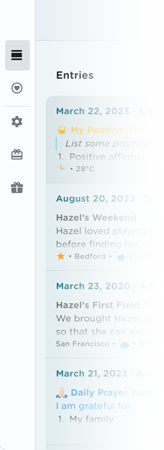
Now, on larger screens, users can now enjoy a more user-friendly interface that makes using our app a breeze.
2. Added Support To Passcode Reset via Email
With the new Journey web update, Journey's passcode reset system has received a significant update that offers users a secure and convenient method to reset their passcodes.
Previously, in order to re-set passcodes in the web app, users had to contact Journey via the Help Desk for assistance.
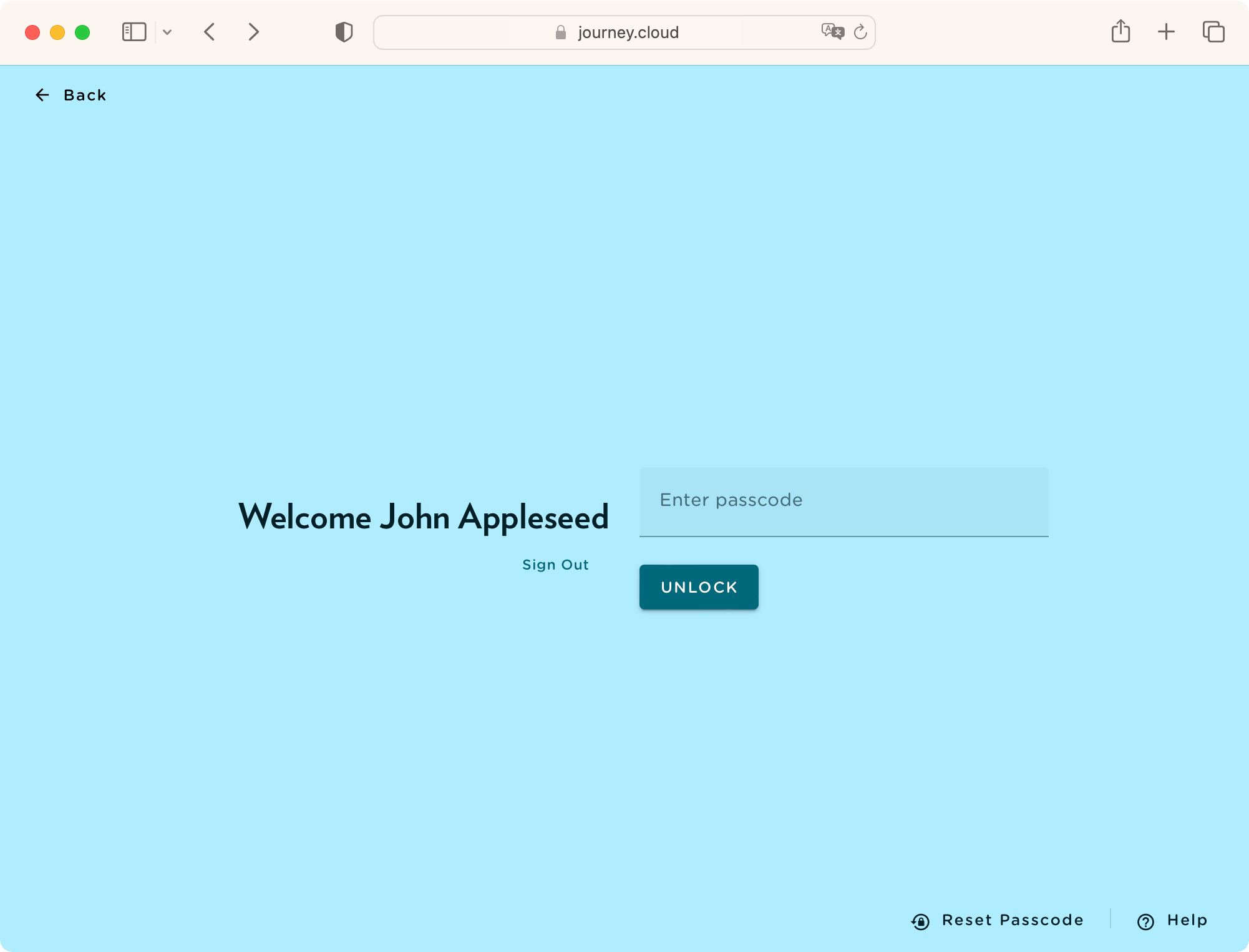
Now, in the event that you forget your passcode, you can click "Forgot Passcode" at the bottom right of the page and an email containing a temporary passcode would be immediately sent to your registered e-mail address. This temporary passcode would be available for 24 hours and can be used to bypass the passcode page to regain access to your Journey account. Users can then set a new passcode anytime after within 24 hours.
This new feature provides peace of mind and reinforces the protection of your account, while being a lot more convenient and giving you full control over the passcode reset process.
3. Create Custom Templates
Amongst some of the new features we have added to our Journaling tools on Journey, users can now create their very own journaling templates. With this new functionality, you can personalize your journaling experience even more than before. Whether you want to add your own journal prompts to use repeatedly, amend journaling categories, or if you want to change the layout of an already existing template, the possibilities are now endless. The flexibility of using custom templates allows you to experiment, iterate, and refine your journaling templates over time.
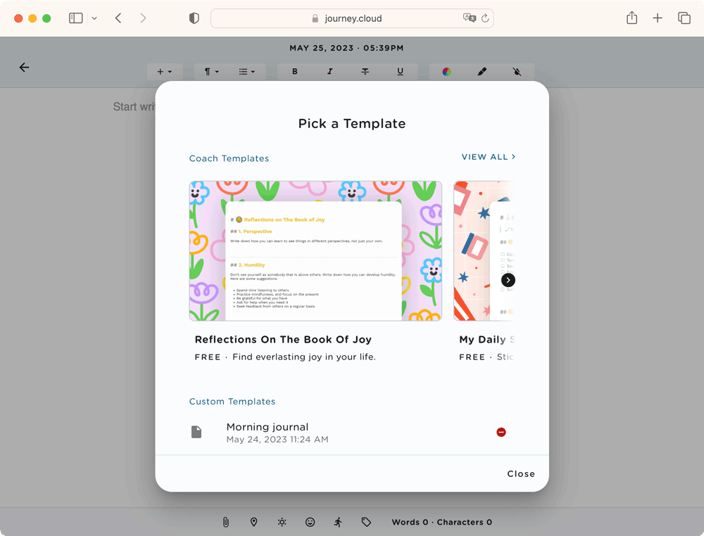
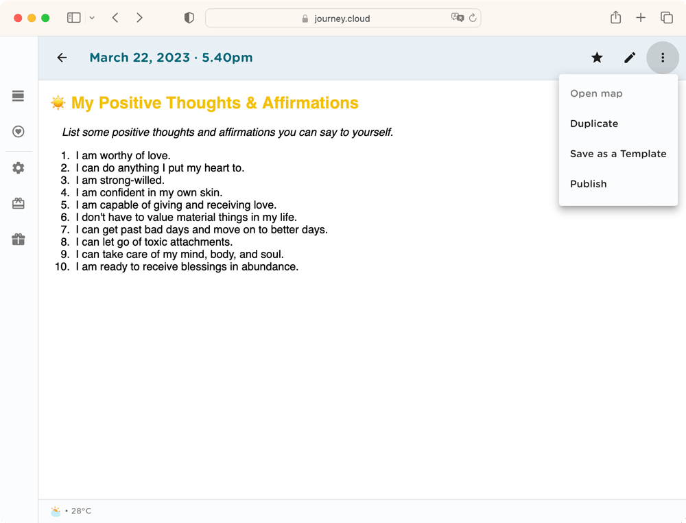
Create and customize your templates to suit your unique needs and preferences on the editor by creating a new entry and turning it into a template by creating a new entry, saving it, opening it from your timeline, and selecting "Save as Template" from the top right corner of the timeline.

You can now have creative freedom, unlock deeper insights, gain clarity, and derive more value from your journaling on Journey web.
4. Delete Templates
Together with being able to create your own templates, you can also easily delete templates and entries that you won't need. Select "template" at the top of your workspace in the editor, scroll down to the bottom to show your custom templates and the bottom of the dialogue box, and click the delete button at the left of your custom templates.
5. Duplicate Entries
If you see the need to use a template that you have created more than once, easily duplicate the template that you would need.
Upon receiving feedback from users about the hassle of using original templates and having to start from scratch, this added functionality allows you to duplicate your templates whenever you feel necessary. Open your entry from the timeline and select "Duplicate" in the top right corner to duplicate your entry to use.
Revamped Date and Time Picker
Journey web editor's date and time picker, amongst other tools, have been tweaked to better function for your journaling needs.
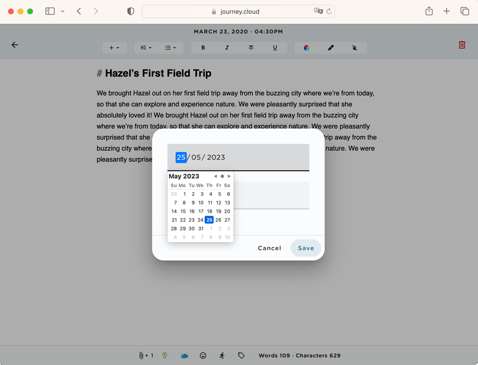
The date and time picker tool in the editor is now more streamlined. Previously, users had to manually pick a time from a clock face to add a journal time, and also pass this step to get to picking a journal date from a calendar view of the entire month. Now, you can pick both the time and date from drop-down menus in the same dialogue box and at the same time. This saves users time, and the hassle of looking at multiple numbers on a clock face and from a calendar view.
Journey Forum
Journey web now also has a brand new forum that can foster engagement, and community collaboration on Journey. This feature allows users to pose questions and seek answers from their fellow Journey users.
Users can post their questions regarding Journey on the forum and other users can answer these questions. The forum's interactive function can enrich the user experience, promote a sense of community on Journey amongst users.
In light of working towards making your journaling and reflection processes as seamless, efficient, and as enjoyable as possible, we are thrilled to be able to have let you in on these latest updates to Journey web.
While we have worked on improving the efficiency and user experience of the interface, we have kept in mind how we want you to feel while navigating the app. With the improved colors, layout, and streamlined content on web, we hope that these latest updates better serve you as an all-encompassing journaling and self-care companion, that you feel safe and comfortable using!
Journey web will be available on 29 May 2023.


