Journey iOS and Mac Updates - March 2023
For the month of March, we are excited to let you in on details about the latest version, Version 5, of Journey on iOS and Mac! The latest updates to our design, aesthetic, and some of our tools are bound to elevate your journaling experience. Read on to find out more!

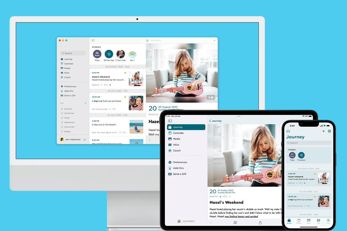
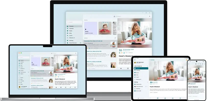
This March, we are excited to announce that the latest version of Journey, Version 5, on iOS app and Mac will adopt a revamped design, a refreshed color palette, and multiple other tweaks to the app's interface.
Journey's latest updates now offer users an elevated journaling experience with the addition of new features across iOS and Mac such as brand-new color themes, refreshing neumorphic imagery throughout the app, a new typeface, a new two-pane customizable layout, and more.
Read on to find out more about these features and what you can expect in Version 5 of Journey on the iOS app and Mac!
iOS and Mac Updates

1. Revamped Color Schemes
One the main experiential and aesthetic changes you would be seeing on the latest version of Journey would be the overall color and contrast of the interface. Color and contrast can be used to help users see and interpret your app’s content, interact with the right elements, and understand actions better. We designed the app to have sufficient contrast ratios which allows users to distinguish various text and non-text elements. This color scheme and the contrast rations have been designed to also work well in both the light and dark theme.
Updated 13 Color Themes
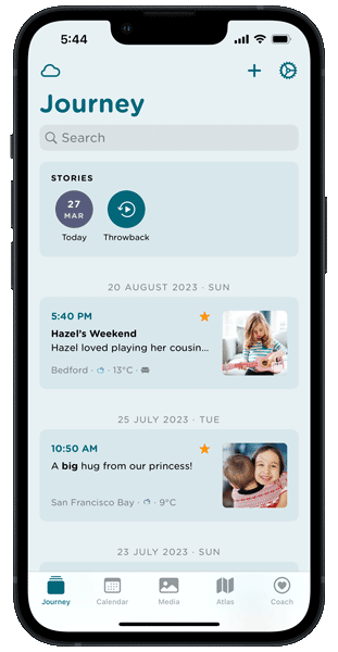
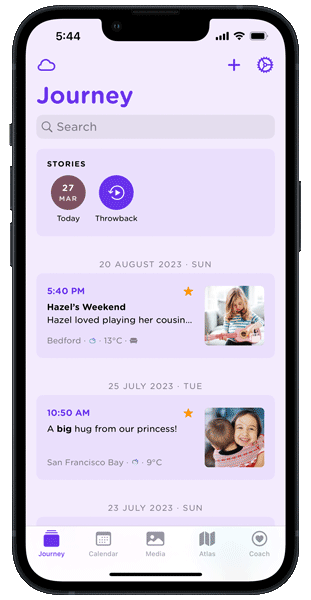
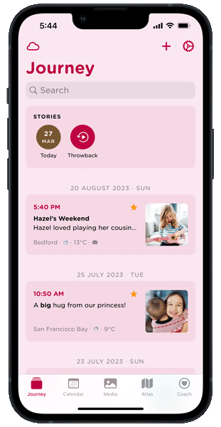
To add on to the color and contract updates on Journey iOS and Mac, you can now also pick a color theme from a curated list of 13 options. These color themes are all equally readable and accessible. Compared to previous versions of Journey, these color themes are also more balanced, subtle, and easy on the eyes, providing a more comfortable and pleasant journaling experience.
Even when you toggle between the light and dark modes, the color theme that you choose will still be well reflected throughout your journal. While the light mode reflects your chosen color theme more prominently, the app's background in dark mode will still reflect a more subtle version of your chosen theme.
Being able to choose a color theme that you like for your personal diary makes space for more expression and creativity than before.
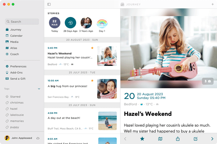
2. Neumorphic 3D Images
In past versions of Journey, Journey's interface was populated by flatter, more 2D designs. In Version 5, Journey has adopted a fresher look with the introduction of neumorphic designs. These imageries can be found on the onboarding pages, alert dialogs, add-ons, and more.
This visual style that combines background colors and shapes, is markedly different from Journey’s previous flatter and more minimal imagery. Now, the imageries that are interspersed in the app, from what you see on the onboarding pages, to the empty states, and various tools like the calendar, atlas, and Journey Coach mimics real-life objects a little more to bring realism to the interface and your experience.
3. Font Changes - Type & Size
Typography plays an important role in the way users interact with an app and how they perceive a digital space. If content is cluttered with varying point sizes and types, content will be lot more difficult to read.

In this version of Journey, the font type has been changed to Gotham Rounded, a more rounded, friendlier typeface.
The lettering in the Gotham Rounded font is inspired by the signs that populate New York City. This font is straightforward and non-negotiable, and yet still retains a personality that makes you feel welcomed on Journey. Together with practicality and the fact that it enhances the readability of text in the app to provide a more comfortable reading experience for users who wish to relive their memories, the rounded aesthetic of the lettering has a friendlier and more personable nature. It allows users to efficiently navigate the app and comprehend the content on Journey quickly, while feeling at ease with the friendly and playful style of the font.
Mac Updates
Together with the above updates that you can experience on both the latest versions of Journey on iOS and Mac, Version 5 of Journey's Mac app specifically is now more optimized for Mac than ever before.
Journey Mac uses the Mac Catalyst technology. This allows a quick port of Journey's iPad OS app into the Mac app. The downside of using Mac Catalyst technology is that the app interface is catered to touch screen gestures rather than the use of the mouse and cursor.
Hence in this version, we have designed the Mac app to be optimized for the Mac. You will find elements of the interface such as the buttons, date picker, and text fields to be much more familiar and native to the Mac. These latest developments offer our users an improved desktop-class experience.
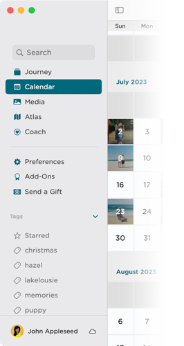
1. Revamped Sidebar
In Journey Mac Version 5, the sidebar has been revamped to include more navigation options. Search and tags are now shown in the sidebar. This allows you to navigate and find your journal entries associated with the tag a lot more efficiently. You can also further refine your search by using both the tag and search phrase at the same time.
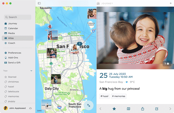
2. Two-pane Layout
The latest Mac app also comes with re-worked navigational behavior. For default, the layout has an adjustable two-pane window, in which the width of the left or right pane can be adjusted to your preference. Together being being able to view more tools at the same time of journey, such as the atlas on the left and a journal entry of yours on the right, you can also customize the width of your panels to however you'd like with the new two-pane layout.
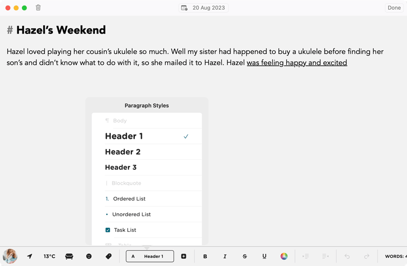
3. Consolidated Menus
In Version 5, both the "Paragraph styles" and "Insert" options have been consolidated into a pop-up menu. You will be able to view and select from the paragraph style options available quicker, and use the insert links, table, or divider tools effortlessly via the pop-up menu.
In light of working towards making your journaling and reflection processes as seamless, efficient, and as enjoyable as possible, we are thrilled to be able to have let you in on these latest updates to Journey on iOS and Mac.
While we have worked on improving the efficiency and practicality of the interface, we have also kept in mind how we want you to feel while navigating the app. With brand new color schemes, an array of themes to personalize your journal with, more and customizable layouts, a more approachable and friendlier font, and the further consolidation of our tools in the editor, we hope that the latest version of Journey better serves you as an all-encompassing journaling and self-care companion, that you feel safe and comfortable using.